 VF / 002
The store is the brand, not a theme around it
A lot of “premium” stores are a logo dropped onto a marketplace template. The product photography is good. The Instagram is better. Then the customer lands on a grid that could belong to any catalogue in the country: identical cards, a shouty sale badge, and a checkout that asks for an account before it earns one. The brand they fell for does not survive the click.
That gap is expensive. People buying rugs, crafts, jewellery, fashion, or furniture are not hunting the cheapest SKU. They are deciding whether this house is careful. The storefront is the first room they enter. If the room feels generic, the price feels risky.
Premium commerce is not more motion. It is a buying journey that never cheapens the goods.
Shopify, WooCommerce, and custom stacks can all look expensive or cheap. The platform is not the brand. The sequence is: how someone discovers a collection, understands a piece, trusts the house, and pays without the spell breaking.
Design the journey, not the decoration
Effects are easy to sell because they show up in a walkthrough. A considered journey is harder to screenshot and much easier to feel. A visitor should always know where they are, what this collection is for, and how to look closer without being herded into a popup.
- 01Arrive with context
Homepage and collection pages should say whose taste this is. “Handmade rugs from Bhadohi” is a place to stand. “Shop now” is not.
- 02Browse like a gallery
Filters, spacing, and image crop should help someone edit, not overwhelm. If every product shouts, nothing is curated.
- 03Decide on one piece
The product page carries the weight: materials, scale, story, delivery, and a calm next step.
- 04Pay without a jolt
Checkout should feel like the same house. Surprise logins, surprise fees, and surprise forms are how luxury leaks.
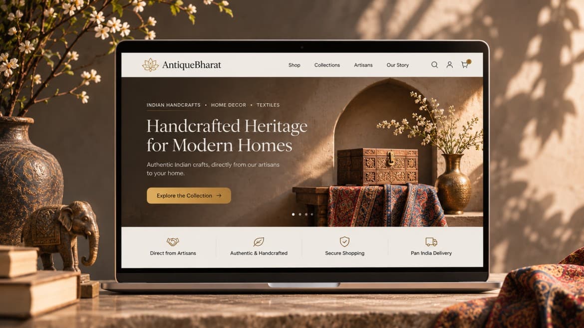
That sequence is what we mean by a storefront that feels as good as the brand. Antique Bharat needs heritage and trust in the browse. Rugs Bhadohi needs photography, collection logic, and a checkout safe enough for a high-consideration buy. Same commerce primitives. Different rooms.
Collection pages should feel curated, not dumped
The collection page is where most themes fail first. They render a database: 48 identical tiles, a filter drawer nobody opens, and titles that read like SKU codes. A brand store edits. It groups by story, room, craft, or use. It lets photography breathe. It makes the second click feel like choosing, not scrolling a warehouse.
- Lead with a point of view: the collection name, a short line, and imagery that sets taste before the grid.
- Keep cards honest. Crop, hover, and price should help comparison without turning the page into a marketplace shout.
- Filters must match how customers think: size, colour, craft, room — not internal inventory fields.
- Empty and sparse states matter. Twelve considered pieces beat eighty items that look like leftovers.
The product page has to carry the purchase
For low-ticket goods, a sharp image and a price can be enough. For anything a customer will live with — a rug, a brass piece, a jacket — the product page is the salesperson. It has to answer the quiet objections: Will this look cheaper in my room? Is the size honest? What is it made of? How long will it take? Who stands behind it if something is wrong?
Put those answers next to the ask, not in a collapsed FAQ three scrolls down. Hero media should show scale and texture, not only a studio beauty shot. Details should be scannable. Related pieces should feel like a stylist, not an algorithm dumping leftovers.
- Photography that includes context: on a floor, in a room, in a hand. Beauty shots alone hide size.
- Materials, dimensions, and care written like a human, not a spec sheet dumped from ERP.
- Delivery, returns, and made-to-order timelines before the customer starts the checkout.
- Proof that matches the price: a named customer, a craft story, or a studio process — not a generic five-star widget.
Checkout should not feel like a different company
This is where expensive brands lose people they already convinced. The product page was calm. Then checkout asks for an account, hides shipping, reloads into a cramped form, or offers twelve payment logos and none of the ones the customer trusts. Intent is highest here. Friction is most expensive here.
Guest checkout, visible totals, familiar Indian payment paths, and a short form are not “basic.” They are how you keep the brand intact at the moment of money. If you need an account, explain what it is for after the order, not as a gate.
If checkout looks cheaper than the product, the customer starts negotiating with themselves.
Speed and mobile are part of the material
Luxury that loads in four seconds on a mid-range phone is not luxury. It feels unfinished. Heavy galleries, autoplay video, and unoptimised zooms are the usual culprits. Customers browse shops standing up, in a car, or on the sofa with one thumb. If pinch-zoom is required to tap Add to cart, the craft of the page is already gone.
Treat performance as a material, like wool or brass. Compress images as if they were product photography for print. Keep type readable. Keep the primary action reachable. A considered store can still be fast. The two are not a trade.
A storefront checklist before you add more effects
You do not need a new theme to find out whether the shop feels like the brand. Walk the journey on a phone as if you had never seen the catalogue.
- Open the homepage. Can a stranger say what kind of house this is in five seconds?
- Open one collection. Does it feel edited, or like an export of every SKU?
- Open the most expensive product. Are size, material, delivery, and trust next to the price?
- Add to cart as a guest. Count surprises: login walls, extra fees, broken back-button, tiny taps.
- Pay with the method your actual customers use. If you would rather message the founder, the store is not finished.
- Only then discuss animation, 3D, or a new visual effect.
A storefront that feels as good as the brand is quieter than an awards-site demo. It is a room people want to stay in long enough to buy. That is the work.
Questions
- What makes an online store feel premium?
- Not animation. A premium storefront feels considered: curated collections, honest product pages, photography that matches the goods, and a checkout that does not break the mood. The buying journey is the brand.
- Why do luxury brands lose sales on generic e-commerce themes?
- Generic themes treat every product like a commodity. High-consideration goods need space, story, and trust next to the price. If the store looks cheaper than the product, buyers hesitate or go back to WhatsApp and Instagram.
- What should a product page include for high-ticket items?
- Clear hero photography, materials and size without hunting, delivery and return facts, social proof that matches the price, and one obvious add-to-cart or enquiry action. Effects can wait until those basics feel inevitable.
- Is a custom e-commerce website worth it for a growing brand?
- If catalogue, photography, checkout, or operations no longer fit a theme, yes. A purpose-built storefront can still use proven commerce primitives. Custom should serve the buying journey, not invent a new shopping language.